Wednesday, November 7, 2012

Curve Stitching

Curve Stitching, also known as String Art, was first introduced by Mary Boole, a self-taught mathematician and wife of George Boole (the father of Boolean Algebra to which Mary also contributed quite a bit).  The idea is to draw a design with straight lines, then subdivide the lines (usually at regular intervals) and connect points on two adjacent lines, again with straight lines (1 to 1, 2 to 2 and so on) as shown below:


How to create a Curve Stitch Design


The interesting thing is that because the straight lines meet at an angle, there is an illusion that you have created a curved line by drawing straight lines.  And the more subdivisions you make in the original two lines, the smoother the curve looks.

There is an interesting article in Maths Plus about the relationship between these Curve Stitches and Bezier Curves:  http://plus.maths.org/content/bridges-string-art-and-bezier-curves
Jason Davies also has a nice animation illustrating how Bezier curves are formed..

There are many very nice examples of String Art on the web.  One of my favourite sites is by Lionel Deimel (
http://www.deimel.org/rec_math/cube.htm).  Lionel has experimented with computer programs to create some very detailed examples and he gives a very thorough explanation of how he created the images.

There is also a Pinterest board with some lovely examples (mostly made with string): http://pinterest.com/bonkaperry/art-string-art

Here are some ideas for creating Curve Stitches of your own.

Approach 1: Graph paper

The easiest way to start is with a ruler, a pencil and some graph paper.  Draw a few lines, mark divisions on the lines and connect them.  Any easy way to play around with the divisions is to measure the length of the line, divide it in half and place a mark.  Do the same with the line you want to connect to and join the two marks together.  Next take the two smaller line segments you have created on the first line and divide them in half.  Repeat for the line you are connecting to.  Join the marks (make sure you match up the right ones!).  You can do this over and over again until you have the number of divisions that you think looks nice or you get tired.  Make sure your pencil is sharp!


You can also create String Art with string and cardboard as shown by Wen Jin Chow:

http://wchow.home.znet.com/SquareArt.htm

Approach 2: Scratch

You can use the Pen and Motion blocks in Scratch or BYOB to create computer String Art designs.

I used a BYOB program to create the picture below:

Screen Shot of Output from BYOB program

I recommend that you try mapping out the design on graph paper first, assign coordinates to the ends of the lines and then create the design in Scratch or BYOB.  Once you have created a design in BYOB, you can play around with different things like pen colour, pen size, the number of times you divide the line and the placement of the original lines.

If you don't feel like writing your own program, you can use the following Scratch program to create String Art on the computer:  http://scratch.mit.edu/projects/Paddle2See/50076
Just click to make three dots and the program will fill in the lines for you.  Keep clicking to extend your design.

Approach 3: Inkscape Path Effect

The one drawback of Scratch and BYOB is that the canvas for drawing is pretty small and the lines are not very fine.  If you want more precision, you might try a Scalable Vector Graphics tool like Inkscape.

There are at least two ways to create Curve Stitches with Inkscape.  The first is to use the built in Path Effect tool.  To do this, draw two lines using the Pen tool.  Select the two lines and from the top menu bar select Path -> Combine:

Step 1

Next, from the top menu bar select Path - > Path Effect Editor...

Step 2
Finally, in the Path Effect Editor, choose "Stitch Sub-paths" from the "Add new effect " drop down and click on the "Add" button.

Step 3
You should now see lines drawn between the two original lines.  You can adjust the number of lines that are drawn using the "Number of paths" field.

Step 4
 Now that you have created a stitched curve, you can use copy, paste and group to combine the curves in interesting patterns.  The following design is based on Circular Designs by Deimel:
Curve Stitch Circular Design based on Deimel's design
(Here is the SVG Image)

Approach 4: Inkscape Extension

If you want to be more precise, you can use Inkscape Extensions and a write a python script to generate the lines.  I used the pTurtle class which provides a nice turtle graphics style API and created a simple Inkscape extension.  To try it out, copy the following two files:

curve_stitch_1.inx
curve_stitch_1.py

and placed them in the "C:\Program Files (x86)\Inkscape\share\extensions" (or wherever your Inkscape extensions folder may be).  Then in Inkscape select "Extensions -> My Math Art Examples -> Curve Stitch 1..."  This extension was used to generate the picture below which is based on Deimel's Isometric Cube design:


Curve Stitch Isometric Cube design based on Deimel's design
(Here is the SVG Image)


Monday, April 23, 2012

Super Spirals

After learning about rotation, the next step was to explore spirals. Just like circles, spirals go around and around. The difference is that with a circle, the radius always stays the same but in a spiral the radius keeps growing (or shrinking if you prefer). We looked at two ways to make a spiral using Scratch. The first way is very similar to the program used in Going in Circles. The main difference is that in the repeat you change the size of the shape using the "change size by" command. In our code we used the number "-1" -  the negative number makes the shape get smaller by 1% each time. You can also use a positive number and make the shape get bigger each time.

You might like to play around with Colour Gradients for this project. A colour gradient is a gradual change from one colour to another and gives the art work a feeling of depth. To create a gradient, draw a shape then select the paint bucket tool. Just below the bucket, click on one of the pictures showing a gradual change from black to white. Then pick two colours from the palette. Finally, click on a region of the picture that you want to fill with the gradient. Also don't forget to play with the position of the center of the costume.

Here are some examples that the students created:
This one uses the angle 137.507, also known as the golden angle. It can be found in sunflowers and pine cones:
Another way to make a spiral is to use the Pen commands in Scratch. You can draw any shape, for example a triangle or a square by using the "pen down", "turn" and "move" commands. To turn this into a spiral, you need to change the distance you move each time you draw a side of the shape. To do this, we use a variable which we called length. The variable is initially set to a small size like 3 and on each repeat we increase the size of the variable using the "change [variable]" command. Play around with how much the length changes each time and see what this does to the spiral.
You can also play around with how much you turn in each repeat. In the picture below, the left side of the picture turns 120 degrees - this gives us a triangular spiral. The right side of the picture turns 121 degrees each repeat. See what a difference this little change makes? Now it looks like you are drawing curves using straight lines.


Here are some examples that the students created:

This one uses a random number for the line width:
 This one draws two spirals:


This one changes the pen color by 50:


Going in Circles

The first thing we tried in our Digital Art after school club was creating copies of a shape around a circle. This can be done with a simple program in Scratch. The following script will create 6 copies of the shape (repeat 6) and the copies will be placed evenly every 60 degrees (360/6) around the circle:
The shape that is copied with the stamp command is the costume of the Scratch sprite which you can edit by going to the Costumes tab and clicking on Edit. The turn command will pivot the shape around the center of rotation. By default the pivot center is the center of the costume. You can adjust this by clicking on the "Set costume center" button at the bottom of the editing dialog. A vertical and horizontal line appear which you can drag around until the place where they cross is at the point you want to pivot about:
By moving the center of the costume around you can get some interesting effects:
Here are some examples that the students created:
Other things to try are changing the colour using the "change color effect" command or turn by random angles inside the repeat using the random number generator.

Sunday, March 18, 2012

Mathematical Art for Elementary School Students

As mentioned in my previous post, I have been leading an after school club for elementary school students. We create Digital Art and in the process explore interesting concepts in Mathematics and Computer Science.

In future posts I will give more detail about the individual projects but first I will give you an overview of the ideas we explored over an eight week period:

Rotations and Spirals
- dividing a circle into even (360 / 60 = 6) and not so even (360 / 51 = ??) pieces; looking at the similarities and differences between circles and spirals (medium: Scratch - a visual programming environment for kids).


Fractals - self-similar patterns such as Sierpinski Triangles and Koch Snowflakes (media: BYOB - an extension to Scratch which allowed us to play with recursion; paper and pencil; Inkscape - a free vector graphics tool).


Tessellations - how to create shapes that fit tightly together and cover an area (media: pencil and paper, Inkscape).


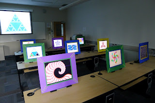
To cap it all off, we held an Art Show featuring over 200 original creations from 20 young artists who ranged in age from 7 to 13. The Digital Art was presented on 10 monitors placed behind picture frames adorned with macaroni. The pictures frames were the brain child of my friends Carollyne Yardley (artist) and Duncan Ayre (macaroni expert).


Despite the tight constraints imposed by the Mathematical concepts explored in each project, the students showed a great deal of imagination and created unique and personal interpretations of the ideas. I was very pleased with the results and the keen interest shown by the students. Can't wait to do it again!

Tuesday, January 31, 2012

Fun Videos for Mathematical Art

I have been leading an after school club for elementary students in which we explore Math through Digital Art. The tool we have been using is BYOB - Build Your Own Blocks. It is an extension of Scratch, a very popular visual programming tool from the Life Long Kindergarten lab at MIT. BYOB exposes more of the capabilities of the underlying Smalltalk-like language called Squeak and, true to its name, allows the user to make new blocks. This has opened up a whole new range of topics we can cover -- such as recursion which allows us to create fractals.

During the course, I have been showing some videos which feature fun and interesting aspects of Math and Art. I thought I would share some of them with you here.

The first is called The Line and the Dot: A Romance in Lower Mathematics. Based on a book by Norten Juster, the film from the 1960's tells the story of a romance in two dimensions. Like the book Flatland, there is an underlying social commentary.


The next video, called Canon, is by Norman McLaren, an early Canadian animator. This film is also from the 1960's and uses the idea of a musical round, like "Row, row, your boat", but in a visual context. My students will create their own animations with this theme.


Finally, I would like to share the video Bicycle Animation by Katy Beveridge. You can actually buy one of these amazing wheel covers from her but be warned you only get the animation affect when filmed through a camera - if you are riding your bike down the street the people watching will just see a white blur. As a group, my club discusses how the eye and the brain work in order to provide the image that we perceive as reality.


There are several similar videos such as the one below called The Cyclotrope by Tim Wheatley.

Sunday, January 10, 2010

Math Visualization Videos

The following two videos show animated visualizations of abstract concepts in math which I found quite interesting and inspiring:

Outside In


(Image from The Geometry Center)

In 1957, Steve Smale proved that it is mathematically possible to turn a sphere inside out (sphere eversion) without tearing, puncturing or creasing the surface, as long as one allows the sphere to intersect itself. That is, the surface of the sphere can be pulled and twisted like a sheet of rubber and can also pass through itself. Given these properties it can be reshaped in such a way that the inside surface becomes the outside surface. This problem in differential topology is known as Smale's Paradox. "Outside In" is a 22 minute video created in 1994 by the Geometry Center at the University of Minnesota. It presents a possible implementation of Smale's solution based on the ideas of Bill Thurston. It is accompanied by the book Making Waves: Outside In which explains the mathematical concepts behind the visualization in greater detail. The video illustrates the rules that govern the behaviour of the sphere using two and three dimensional examples and then demonstrates how the sphere can be everted in compliance with these rules.

This video is one of the reasons I decided to go back to school and study Math Visualization. It is very effective at conveying a complex topic in mathematics without requiring the viewer to understand the symbols and language of differential topology.


Not Knot


(Images from The Geometry Center)

This one, also from the Geometry Center, is a little harder to follow but worth taking the time to understand. It describes knots and their complements (a complement is the space around the knot - hence the title Not Knot). The complements tend to have a hyperbolic geometry and thus the video has an interesting representation of hyperbolic space.

It might help to read the book Flatland: A Romance of Many Dimensions by Edwin A. Abbott. This book is both a commentary on Victorian social class structure and an exploration of three dimensions from the perspective of a person living in a two dimensional world.


Wednesday, July 22, 2009

The North Coast Trail

To celebrate Canada and all of its rugged beauty, I went on a 6 day hiking adventure along the North Coast and Cape Scott Trails. These trails are located at the very north west end of Vancouver Island between San Josef and Port Hardy.

My companions on this adventure were Andrew (my beloved, gorgeous fellow on the far right), Chris (aka Hop-Along-Kid, far left) and Bruce (aka The Mighty Bruce, very useful for tossing people over impassable chasms, second from right).

The North Coast Trail is pretty rugged. It officially opened May 2008 and while much has been done to mark the trail and set up the campsites, it is still quite a wilderness adventure. In my opinion, it makes the West Coast Trail look like a cake walk.

We started the trip with a boat ride to the trail head at Shushartie Bay. Eventually there will be a dock there but for now our captain drove his boat up on the rocks and ran the motor to hold it there while we jumped off the bow, packs and all.

In a few spots, particularly the stretch between Skinner's Creek and Cape Sutil, we had to climb up or down some steep banks with the aid of some hefty ropes. This was a made a little more exciting by the fact that we were carrying heavy packs (mine weighed about 50 lbs).

We are seriously thinking about what we can do to lighten our packs for the next trip. Along the trail we heard rumours about two guys from Austria who were only carrying 25 lb packs - they were sleeping in hammocks and eating fish or shell fish that they gathered along the way. We also met a father and son from Vancouver who were dining on pizza, bacon and eggs and pancakes and their packs only weighed 35 lbs. We ate oatmeal for breakfast, Cliff Bars for lunch and Mr. Noodles with Beef Jerky for dinner. Every day. With sand for seasoning.

The North Coast Trail has two cable cars for crossing the larger rivers and for the rest you just have to improvise. The first stretch between Shushartie Bay and Skinner creek is a series of muddy bogs. There are a few boardwalks but it had been raining the week before our trip so the mud was deep and thick. At one point Bruce sank in so deep that the mud came above his knee. He advised the rest of us to try a different route. There are also many trees fallen across the path to climb over or try to duck under. This made for slow going at times. For the first two days I think we were only travelling at 1.5 km/hour.


The Cape Scott Trail has some very nice log bridges with hand rails that are just the right height for resting your pack. It has been open since 1973 and is much more established than the North Coast Trail. It has many boardwalks over boggy areas, kilometer markings and general signs of civilization.

The beaches here are quite sandy and there are many nice day hikes you can take to the lighthouse or to the old farmsteads. After trekking through the wilderness for 5 days we came upon two young girls skipping along in crocks. I was expecting to see a parking lot full of caravans just around the corner. I wonder what they thought of our large packs and mud caked gators.

At the end of our journey we caught a ride from San Josef back to Port Hardy. It was from this van that we saw the only bear of our entire trip. We had seen lots of bear skat along the way, some even still steaming, but no bears. I am quite OK with that. We also stopped to pay homage to the trail by the "Tree of Lost Soles" where many travelers have abandoned their muddy boots. We finally arrived at the C&N Backpackers hostel where we enjoyed a long, hot shower then went out for a beer. Another adventure safely concluded.